
Content Presentation Guidelines
There are several components to consider as you organize your content for presentation. Review these guidelines to better understand the various options for content presentation.
Content Containers (Cards and Panels)
Usage
Content containers are groupings of information about a single subject.
They should be easy to scan for relevant and actionable information. Elements, like text and images, should be placed within them in a way that clearly indicates hierarchy. Cards should provide feedback to the user when interacting with the card (as appropriate), such as subtle animation upon flipping or moving a card.
Unifi Design System: How to implement Cards and Panels with Unifi Angular.
Cards vs. Panels
Programmatically, there is some overlap between Cards and Panels, but a panel includes a freeform content pane, whereas cards are typically shown in groups with one focused topic and associated action per card. In addition, cards often use imagery to enhance their appearance whereas panels optionally include a simple icon to represent the topic.
Use
- Content is identifiable as a single, contained unit.
- Content can stand alone, without relying on surrounding elements for context.
- To display a structured layout to provide content or functionality as an entry point to an application or additional details.
Do Not Use
- Content cannot merge with another card, or divide into multiple cards.
- When emphasis of rank is important, such as for search results, or information best shown in a list.
Examples and Variations
Card Container
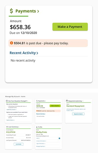
This payments card is one of a group of cards displayed on the borrower dashboard. This example gives a summary of their next payment due, and a link to make a payment.
Generally, dashboards provide the most relevant information in a quick-glance overview format. Then each card should provide a means to access the related details.
Card Container
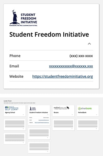
This Student Freedom Initiative (SFI) card is one of a group of cards displayed on a lender list dashboard. This example gives a snapshot of the lender, and a link to view applications related to that lender.
Collapsible Container
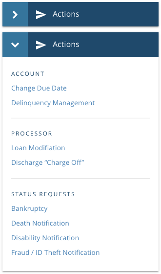
The optional collapse function allow the user to show or hide content based on their preference. This container is open by default, but the user can close it to maximize their screen space. See note about progressive disclosure*.
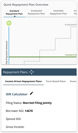
Complex Container
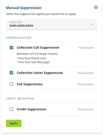
Panels can contain quite a bit of information, as long as the content is related to a single subject. This one allows the user to suppress different types of communication being sent to the borrower.
Progressive Disclosure
Providing content that the user can show/hide on their terms, applies the principle of progressive disclosure. This is an effective UI design technique for keeping the UI clean and simple without sacrificing functionality. Make sure the label used on the control that reveals the content is clear to set the expectations of the user
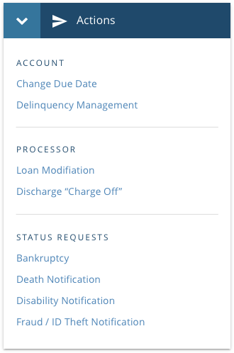
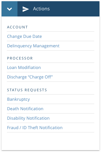
Dividers
Usage
A thin line that groups content in lists and layouts.
- Should be noticeable in a layout, but not jarring.
- Only be used if elements cannot be separated using white space.
- Often used in conjunction with Lists to provide a visual separation between content groups.
Use
To group items
Do Not Use
To separate individual items
Tabs
Usage
Tabs organize and allow navigation between groups of content that are related and at the same level of hierarchy.
Keep tab labels short, and use Title Case.
Unifi Design System: How to implement Tabs with Unifi Angular.
Use
To display related sets of information or functionality within a single context or page.
Do Not Use
To navigate to another page, or to trigger an action. Use links or buttons as appropriate instead.
Examples and Variations
Desktop Considerations
- The currently selected tab is always visually indicated.
- Don't use tabs across multiple rows.
Responsive Considerations

- When viewing a tabbed interface within a narrow view port (such as a smartphone)
- Stack tabs vertically; one tab per row.
- The first tab is automatically selected on page load.
- When a tab is selected, its content will appear beneath it, sliding the remaining tabs down. Simultaneously, the previous tab's content will get hidden.
- Only one tab can be opened at a time, providing the same experience as desktop.
White Space
Usage
White space or "negative space" is intentional empty space between and around elements of a design or page layout.
- Is essential for an easily-consumed layout, giving the viewer pause between sets of content.
- Can help keep text line lengths shorter, and easier to read.
- Helps create a professional feel, giving the viewer confidence that content is accurate and organized.
- Should not be filled simply because it's empty space.
- Can be any color as long as it's free of content.
Let's Chat!
Together, we can understand and assist with the challenge or opportunity on your mind.
Connect