
Data Input Guidelines
Properly intaking data can easily be overlooked. There are many techniques and components that are often misused for data-gathering experiences. Review these guidelines to ensure that you gather the cleanest data, and provide the most intuitive experience.
Buttons
Usage
Use buttons to trigger actions or to submit forms.
- Only one primary button should appear within each screen or section. Exceptions may be made when the primary options need to be equally weighted. Exceptions may be made if a persistent Floating Action Button (FAB) is also part of the experience.
- Label buttons with what they do. It should be clear what happens after the click.
- Buttons should be easy to find among other elements, including other buttons.
- In general, when placing buttons on the page, a primary button should appear before secondary or disabled buttons.
- Provide visual feedback by providing a visual change upon mouse hover or keyboard focus.
Unifi Design System: How to implement buttons with Unifi Angular.
Buttons vs. Links
- Buttons are for actions, such as submitting a form.
- Links are for navigation, such as moving to another screen within the application.
- Do not style a button as a link, nor a link as a button.
Use
Label buttons using explicit labels that explain what they do.
Leverage intuitive field errors, rather than disabled buttons.
Do Not Use
Avoid using vague labels that could be confusing.
Avoid using disabled buttons. See Examples and Variations for more information.
Examples and Variations
Variants of the button style should be leveraged to indicate hierarchy.
Contained Button (high emphasis)

Contained buttons are used for primary actions and are distinguished by their use of elevation and fill.
Outlined Button (medium emphasis)

Outlined buttons can act as a lower-emphasis alternative to contained buttons or a higher-emphasis alternative to text buttons.
Text Button (low emphasis)

Text buttons are typically used for less-pronounced actions, including those located in dialogs and cards. In cards, text buttons help maintain an emphasis on card content.
Disabled Button

Disabled buttons should be avoided as they turn off a call-to-action, however they can be used in very rare cases when it is clear by context, user training, or supplemental messaging how to enable the button.
Rather, provide an intuitive interaction by allowing users to make errors, but give them appropriate feedback using field errors.
Rare exceptions for when a disabled button could be considered:
- When a user needs to make a certain amount of selections (i.e. Please Select 3);
- When there are differing user access levels (i.e. Agent can view, but a Processor can edit.);
- For the previous/next buttons on the first/last screen of a paginated list.
Accessibility Note: Disabled buttons inherently have color contrast issues. However, when adjusted to pass the color-contrast threshold it looks enabled, which causes confusion. Also note that disabled form elements will not be included the tab order.
Floating Action Button (FAB)
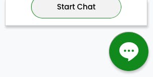
FAB's can be used as a persistent primary action that "floats" above the other screen content. For example, engaging a chat function.
Date Entry
Usage
Dates can be entered in a text input field with data masking, or a date picker control.
Factors such as user group and purpose of the date within the context of the form should be taken into consideration when choosing the field layout for your application.
Unifi Design System: How to implement date-entry components with Unifi Angular.
Examples and Variations
Date Input Field
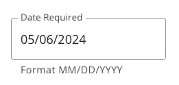
Use a Date Input Field
- For data entry tasks (such as a date read from a printed document), or when the date is known and won't change based on other factors (such as going forward three months from the current date);
- When the date is more than one year from the current date, for example, a date of birth entry.
Interaction Behavior
- Pre-entry: Utilize input masking to automatically insert correct formatting (MM/DD/YYYY).
- Post-entry: Display dates in the traditional United States format of month-day-year (MM/DD/YYYY).
Date Picker
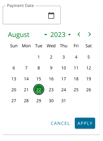
- When consultation with a calendar assists in the user's date selection;
- If there are restricted dates;
- The selected date is relative to something (ex: two weeks from today, 90 days from today, etc.);
- When selecting a range of dates (In this scenario, the second date picker must be aware of the first date picker and provide relevant dates to choose.);
- When date is less than one year from the current date, for example, it is not to be used for a date of birth entry.
Interaction Behavior
- Ensure the user understands the expected format and available options to avoid errors.
- Indicate if specific dates are unavailable (such as dates in the past/future, weekends, holidays, payment cycle limitations).
- Post-selection: Display the selected date in the traditional United States format of month-day-year (MM/DD/YYYY).
- Always provide an alternative way to enter the date (such as an input field) along with the date picker.
- Provide appropriate error messaging if an invalid date is manually entered.
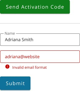
Field Errors
Usage
Contextual and actionable feedback to help users resolve failures and avoid future complications.
- Should be used in conjunction with summary Notification Message that summarizes the error(s), and anchor links to each offending input.
- Make help text visible and easy to read to pre-empt user mistakes.
- If an error message is triggered make sure the message provides clear and concise information about how to correct the problem. Bring adequate focus to the fields in error.
- Provide clear user instructions, labeling and input masks to prevent the need for error messages.
- Remove error state once the issue has be fixed.
Interactions
- Provide instructions/requirements up front to minimize errors. Leverage input masking and/or helper text below the input.
- Do not default to an error state. We don't tell the user they're wrong before they've had a chance to show they're right.
- Trigger an error state if the user enters invalid characters, leaves the field, or submits the form.
- If a required input was bypassed, trigger an error upon form submission.
- When correcting an invalid input, the error state should remain until the requirement has been met.
- Ensure the user has the right information to correct the error.
Visualizations
- Messaging should be a red that meets the color contrast threshold. 4.5:1 for text, and 3:1 for non text. (e.g. Unifi uses #C80600)
- An icon or other visual indicator should accompany an error message so that we don't rely on color alone.
Unifi Design System: How to implement form validation with Unifi Angular.
Examples and Variations
Field Errors

File Upload
Usage
Upload files with file selection, or drag and drop methods.
File Selection Method
- Give the user the ability to browse and select a file. This method will likely rely on the operating system to complete.
- Provide appropriate instructions, such as file size limitations and acceptable file types.
- When necessary, allow the user to upload multiple files at one time.
- Give the user assurance by using a loading indicator.
- Display the file name in the UI once the file is uploaded.
- Allow the user to remove the file once it has been uploaded.
Drag and Drop Method
- The same guidelines (as above) also apply for the drag and drop method.
- For accessibility purposes, drag and drop cannot be the only upload option for the user.
- Ensure the drop zone is clearly indicated. It should be apparent when the zone is active, and when a file can be released.
- Provide ample space for the drop zone.
Forms
Usage
A form is a collection of UI elements that allows the user to enter and send information to a server.
- Use forms to collect information from users, or to modify existing information.
- Fields and labels should be clear, concise and include a visual indication of focus.
- Make help text visible and easy to read to pre-empt user mistakes.
- Make it obvious if the user needs to address any errors. See error messaging best practices.
- Group related inputs to promote an intuitive experience for the user.
Enable/Disable Buttons
- "Submit" - Enable. Always enable a submit button. In addition to the accessibility benefits, allowing a user to choose submit gives the UI the opportunity to highlight any missing information.
- "Update/Save" - Disable. One exception to the rule is when form has pre-existing information. An example is when saving updated borrower demographic information. Disable the update/save button on page load, then enable it once any of the pre-existing input values have been changed.
Button Alignment
Generally, primary CTA buttons should be placed at the outermost edge of the layout, with secondary buttons following inward. In some cases your app may follow a different pattern, so ensuring consistency with button placement is most important.
- Dialog forms - Primary CTA button should be on the far right of the dialog box, with secondary buttons following to the left. Users quickly scan all the content in front of them in a Z pattern without even thinking about it. For that reason, on smaller windows it’s best practice to have the most important action at the end. Hence, bottom, right.
- Full-screen forms - Primary CTA button should be on the far left, with secondary buttons following to the right. If the browser window is large, or you have to scroll down to fill out a form, it’s best to have the primary button right below the last bit of content on the page. The reason is that this is where your users' attention has been focused, while either reading or adding information to a form.
Required Fields
- If the majority of the fields are required, mark optional fields with "(optional)".
- If the majority of the fields are optional, mark required fields with an asterisk, "*", and include a "*required" key within the form.
- If all your fields are required, don't mark any, but indicate in text that all fields are required.
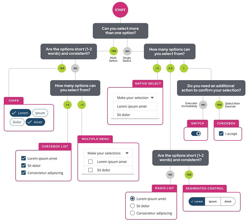
Selection Controls
Usage
Selection controls allow users to complete tasks that involve making choices, or switching settings on or off.
- When asking users to make decisions or declare preferences such as settings or dialogs.
- Should be visible at a glance if a selection control has been selected. (Selected items should be more visually prominent than unselected items.)
- Make it easy to compare available options.
Unifi Design System: How to implement selection controls with Unifi Angular.
User Expectations
Selection controls have been in user interfaces for a long time and should be used as expected.
Use
- Radio buttons when only one item can be selected from a list.
- Checkboxes to let users select one or more options from a list. (A parent checkbox allows for easy selection or deselection of all items.)
- Switches to turn a setting immediately on or off, without additional interaction from the user.
- Segmented Controls over other selection controls to reduce cognitive load.
- Radios and checkboxes should be formatted in a vertical or stacked layout.
Do Not Use
- Checkboxes when only one item can be selected from a list. Use radio buttons instead.
- Switches for a list of multiple options that are subsequently triggered by an action. Use checkboxes instead.
- Segmented controls when longer labeling is needed.
- Formatted radios or checkboxes in a horizontal layout. An exception could be a Likert-like (1-5) pattern.
Examples and Variations
Radios
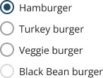
Use when only one option can be selected from a set.
- Generally, the user should need to make the selection, vs. having items pre-selected.
- Use when the user needs to see all available options.
- If available options can be collapsed, consider using a Select menu because it uses less space.
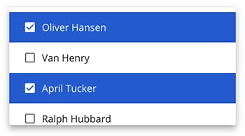
Checkboxes
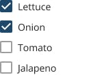
Use when multiple options can be selected from a set.
- Generally, the user should need to make the selection, vs. having items pre-selected.
- Use when user is selecting related items from a list.
- Use to give a clear distinction between the selected and unselected states.
- Use when there is a list of related items to select from.
- When the setting applied by the user should be confirmed and reviewed before the selection is applied.
- If you have many checkboxes, consider alternate ways to gather input, such as multi-select, or multiple selects.
Switches
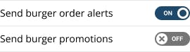
Use when an on/off toggle is needed for a single setting
- Use when the setting change takes effect immediately. For example, switches do not need an additional Save button.
- Switches have a tendency to cause confusion. Implement with great care, and utilize testing.
- Do not use in a long list of multiple options. Rather consider a checkbox list.
- Intent should be made clear by the corresponding in-line label.
Segmented Controls

Use to reduce the cognitive load that can happen with radios and checkbox lists
- Keep labels short.
- Show clear indication that the user can select each segment.
- Should be limited to 2-5 segments.
- Do not use them to navigate content (use Tabs instead).
- Do not use them to filter or as multi-slect (consider Selection Chips instead).
Note: Referred to as Button Groups in the Unifi React documentation.
Selects
Usage
Select components are used for collecting user-provided information from a list of options.
Unifi Design System: How to implement selects with Unifi Angular.
Select vs. Menu
The Select component is often found within a larger group of form fields, unlike the Menu component which is outside of a form.
Use
- As an element within a form
- To collect data within a form
Do Not Use
- Outside of a form
- For navigation
Examples and Variations
Native Select
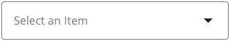
Provide the most accessible component as well as an improved mobile user experience.
Multiple Select
More complex select that allows the user to make multiple selections within one Select menu. This can be used in place of a checkbox list if space is limited, but keep in mind that multi-select should only use for when the list is minimal.
Multiple visual indicators must be used to meet accessibility requirements.
Text Fields
Usage
Text Fields allow users to enter and edit text.
- Fields and labels should be clear, concise and include a visual indication of focus.
- Various states should be clearly differentiated from one another.
- Consolidate numeric inputs (such as a phone number) into one field, and utilize input masking to promote proper formatting.
Input Masking / Pre-formatting
Input masks can help users enter data in restricted inputs, but there are many details to get right to ensure input masks work well for users. Use them correctly and consistently. Input masks can show users, before they even start typing, what format the characters are expected to be in and then auto-apply that formatting to the user’s typed input. If copy-and-paste is a common task in the scenario, ensure that input masking is retained.
Placeholder Text
Placeholder text can help inform formatting, however placeholder text will disappear once an input is activated. Consider other ways to inform the user about formatting, such as helper text below the input. Also, ensure that placeholder text will be read by a screen reader and that it meets the 4.5:1 contrast threshold.
Unifi Design System: How to implement text fields with Unifi Angular.
Error Validation
When considering data inputs, be sure to adopt proper usage for field error messaging.
Examples and Variations
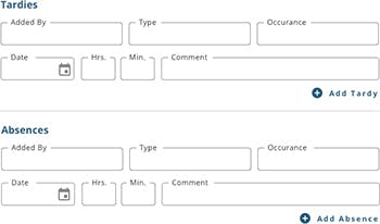
Workspace Layout
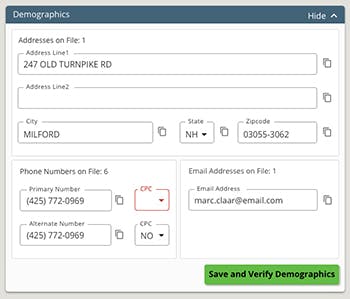
BCMS Layout
Phone Input Masking
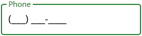
- Pre-format the input to utilize a standard such as the (___) ___-____ construct.
- Also utilize formatting for international numbers in necessary.
- Exceptions may be made for specific style guides, the most important thing is consistency within your app.
SSN/ID Input Masking
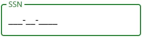
- Pre-format the input to including dashes where they are expected.
- Exceptions may be made for specific style guides, the most important thing is consistency within your app.
Date Input Masking
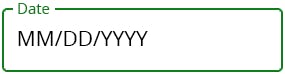
- Pre-format the input to utilize the standard MM/DD/YYYY construct.
- Also consider the use of date pickers vs date inputs.
- Exceptions may be made for specific style guides, the most important thing is consistency within your app.
Masking Sensitive Data
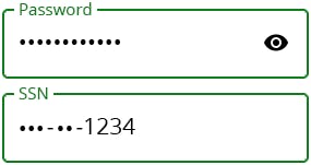
Working with sensitive data is common at Nelnet, and necessary precautions need to be taken within a UI.
- Passwords should always be masked
- SSN's and bank account information should always be partially masked
- You may utilize the view (eyeball) icon so the user can reveal the entered value
- Avoid double-entry inputs, but rather use the view (eyeball) icon so the user can ensure accuracy.
- Be clear about character requirements. Consider dynamic validation, a requirements list that changes as the user enters their information.
Let's Chat!
Together, we can understand and assist with the challenge or opportunity on your mind.
Connect