
Data Presentation Guidelines
Data can sometimes be overwhelming for a user to absorb if not presented appropriately. These guidelines will help you understand how to best present data.
- Quick Links
Chips
Usage
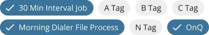
Chips are compact elements that represent an input, attribute, or action. They should have a clear and helpful relationship to the content or task they represent.
- When used appropriately, chips are an intuitive tool for modifying the content they control.
- Chips must be actionable, and should not be used as "view only" or "disabled".
- Chips should be used as a group. Single chips should never be used.
- Non-interactive elements should not look like Chips.
- Carefully consider potential confusion with buttons.
Examples and Variations
Selection Chips
Selection chips use tags or descriptive words and are used to make selections from a set of options.
- Provide a visual indication that does not rely on color alone when selected, such as color and checkmark icon.
- Provide clear instructions to indicate the relationship to the task. (Select One, Select Multiple, Filter By)
- Provide clear visual indication between the selected chip and the content it is manipulating.
- Consider using when there are multiple selections and when a toggle or checkbox will not suffice.
- Consider using Segmented Controls if only one option can be selected.
Note: Consider the Selection Control Decision Tree when deciding what control to use.
Data Lists
Usage
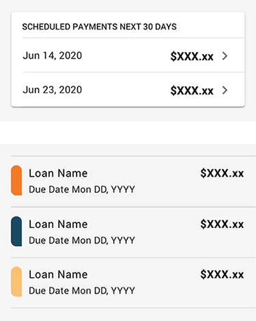
List items contain curated groupings of data that are displayed in the form of a list.
The list item is designed to give the user the primary content they need, and nothing more. The list item is then repeated to form a list of related items.
- Easy to identify a specific item in a list and act on it
- List items should present icons, text, and actions in a consistent format
- Consider the List component in conjunction with Dividers to ensure content is visually separated
Lists vs. Tables
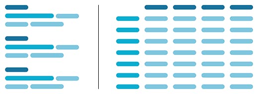
- List - Collection of curated data that forms a repeatable grouping. Each grouping is a list item strung together to form a list. Makes data easy to consume in bite-sized chunks.
- Table - Collection of data points displayed in a grid of rows and columns, much like a spreadsheet. Good for macro-level viewing of data.
Unifi Design System: How to implement lists with Unifi Angular.
Use
- Content sorted in a logical order
- Icons, text, and actions in a consistent format
- Dividers to ensure content is visually separated
- For comparing curated data for a specific scenario such as interest rates
Do Not Use
- Inconsistent placement of content within a list row
- Unclear hierarchy of content within a list row
- Items placed in the center of a list row
- For making open-ended comparisons among an entire data sets
Examples and Variations
Simple Lists
Simple lists can contain a supporting visual (icon/avatar) and up to three lines of text
Complex Lists
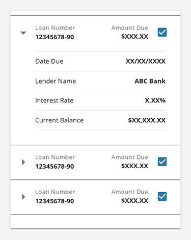
Show and hide details of list items by expanding and collapsing list content vertically.
Checkboxes can also be used as a way of selecting items from a list.
Tables
Usage
Tables provide structure to information to make it easier to understand or manipulate.
- Make sure a table is the best format for the data. Consider if graphics, lists, or other UI elements can do a better job than a table when it comes to revealing patterns.
- Advanced tables let users adjust the data. Things like sorting and filtering can empower users to do more with the data.
Display
To ensure an organized data set that is easy to scan, consider the following guidelines:
- Visually aligning content (see Use / Don't Use section).
- Keep table headings and data clear and concise.
- Order columns (starting with the primary identifier) to ensure the most relevant data is visible and apparent.
- Total/subtotal data should be differentiated from the other content.
- Content should visually dominate, while rules and borders should be secondary.
- Consider table cell content size, and if the content would be better suited within a row toggle.
Interaction
To ensure an organized data set that is easy to navigate, consider the following guidelines:
- Search/filter should include the entire intended data set (i.e. include hidden paginated data).
- Make it clear what term(s) were searched, and the number of results that were returned (if any).
- Provide appropriate error messaging for invalid search/filter entries.
- Consider how the user will clear/reset their search entries.
- Consider performance, and include loading indicators when working with larger data sets.
- Leverage pagination rather than 'infinite scroll' or 'load more'.
- Ensure a single scroll experience, rather than separate scrollable elements on the page.
- Horizontal scrolling within a table is acceptable.
- When table rows are interactive (highlighted upon hover), avoid zebra-stripe coloration.
- Carefully consider accessibility complexity when using sticky headers.
Unifi Design System: How to implement tables with Unifi Angular.
Use
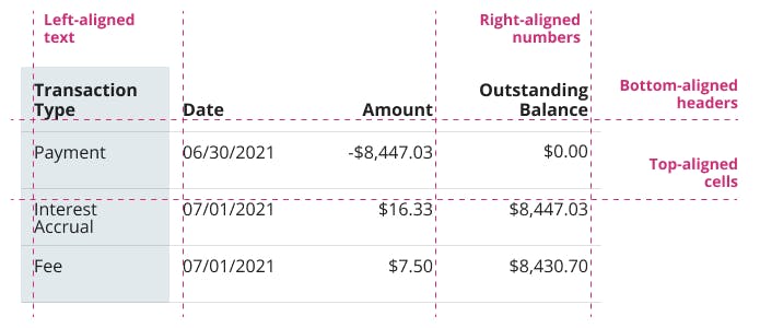
- Left-aligned text
- Right-aligned numbers
- Bottom-aligned headers
- Top-aligned cells
Do Not Use
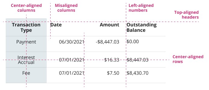
- Center-aligned columns
- Misaligned columns
- Left-aligned numbers
- Top- (or center-)aligned headers
- Center- (or bottom-)aligned rows
Examples and Variations
Simple Tables
For smaller sets of basic data.
Complex Data Tables
For larger sets of data with filtering and sorting.
Let's Chat!
Together, we can understand and assist with the challenge or opportunity on your mind.
Connect