
Messaging Guidelines
Messages bring purposeful and useful information to users attention. We need to communicate with users to guide their journey through an application. The choice of which component to use and how it is implemented will depend on the scenario that the user is facing.
General Best Practices
- Keep messages as brief as possible. Commonly, a heading and content both appear, but it is acceptable for messages to only contain the heading if the message is brief.
- Speak to the user. Remember who you're talking to and make sure the message is readable and does not include technical jargon.
- Draw attention to important content or actions the user needs to take.
- Use the right type of message for the situation. Refer to the examples below for guidance.
Loading Indicators
Usage
Loading indicators communicate feedback regarding system status and response to an action.
Users want to feel in control of the system they’re using, which means they want to know and understand their current context at any given time, and especially when a system is busy doing work.
Timing - Introducing a loading indicator will let the user know that a somewhat longer operation is being executed.
- Use a loading indicator if the expected wait time is more than one second for a screen or data element to appear.
If the wait time is longer than five seconds:
- Determine if there are performance efficiencies that can be gained from a technical standpoint.
- Consider if there is helpful information you could display while the user is waiting.
Placement - Strategic placement will let the user know when information is loading in a certain area.
- If the user is waiting for a whole page to appear, place the loading indicator in the middle of the page.
- If the user is waiting for data in one section of the screen, place the loading indicator within that section. Be sure to provide adequate spacing, particularly for the linear variation. Avoid using individual progress indicators for every data point.
- If the user is waiting for a user-triggered operation to perform (i.e. form submission), consider using an integrated button progress indicator.
Behavior - Loading indicators working in harmony with user actions will provide confidence that the system is responding to the action they've taken.
- When loading a particular section of a screen, only disable that section as the content loads. Make it clear to the user what areas they can interact with while content loads.
- Determinate loading indicators should never animate backwards, especially when using the linear variation (i.e. visually loads to 75%, then dips back to 50%). This can easily cause frustration for the user.
- Integrated button indicators may be preferable over disabling a button. It provides the user feedback that an operation is being performed, and that they do not need to click the button again.
- Determinate indicators may be preferable as it lets the user know how long the operation will take.
Unifi Design System: How to implement loading indicators with Unifi Angular.
Examples and Variations
Indeterminate Linear

Linear visualization of an unspecified wait time. Indicators will grow and shrink in size while moving along the track.
Determinate Linear

Linear visualization of how long an operation will take. Fills the track with color, as the indicator moves from 0% to 100%.
Indeterminate Circular

Circular visualization of an an unspecified wait time. Indicators will animate along a circular track.
Integrated Button

Button visualization of an unspecified wait time. Indicators will animate along a circular track.
Notification Messages
Usage
Notifications are intended to draw the users attention to an important message. They can alert a user of something before they take action, or can inform a user after they've taken action. Be sure the notification message is specific to their current situation.
Unifi Design System: How to implement notification messages with Unifi Angular.
Use
- Use sparingly, to retain their impact.
- Position them to be seen in the appropriate context.
- Use variations, color and iconography appropriately and consistently.
- Write with human-friendly words. Be polite and pleasant.
Do Not Use
- Overuse or dilute their intent.
- Allow the user to dismiss the notification.
- Change generally understood color and iconography uses.
- Use system or jargon words, unless appropriate.
- Blame the user for an action they took.
Examples and Variations
Error Notification

This message should clearly define the problem, why it happened, and how to correct it.
- The user must take action before proceeding.
- Clearly define what the problem is, why it happened, and what to do about it. In the case of a system error, try to offer the user a path forward, even if it's just 'try again'.
- Clearly inform the user how to fix an error. Use in conjunction with in-line field errors to ensure accessibility compliance.
- Messages should be polite, and shouldn't place blame onto the user.
Warning Notification
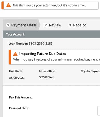
Warning messages should clearly indicate that this needs your attention.
- The user should user should strongly consider the message.
- They ensure the user has the important information they need to help make decisions.
- Messages should be polite, and shouldn't place blame onto the user.
- No further action is required before proceeding.
Success Notification
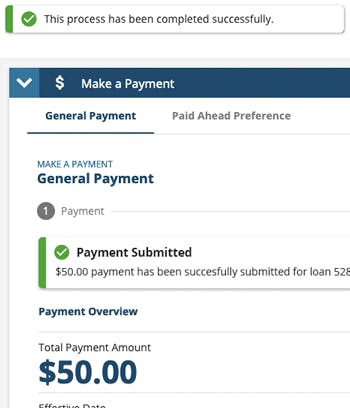
A success message confirms the completion of an action.
- No further action is required before proceeding.
- Note that a success message promotes trust in the application.
- Offer as much detail as makes sense. For example,
- If a task has been completed, the task ID number could be referenced.
- If an email was sent, perhaps the address it was sent to would be useful.
Informational Notification
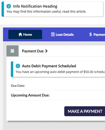
An informational message provides general, yet important information, that is contextual to the situation.
- The user should read and consider this message.
- No further action is required before proceeding.
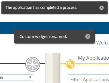
Ephemeral Notification

Ephemeral notifications appear dynamically, and inform the user that an application has performed process. They act as a non-intrusive feedback mechanism (i.e. "don't worry, the system is doing its thing").
- Message should float above the other screen content, vs in-line with the content. Placement and styling should be consistent.
- The message content should be short in length and a offer a "good-to-know".
- Consider how sound or animation could be used to draw attention.
Timing
- Should only appear for around 5-6 seconds, but keep in mind that the short time length may promote anxiety for the user.
- Err on the side of longer, rather than shorter. The user's attention may be divided between multiple tasks or information.
Situations
- Only use when there is a broad and overwhelming expectation that the action will be accomplished successfully. For example, an email was sent.
- Where supporting information does not need to be presented, such as the specific name of a task.
- Cautiously use for errors. Invalid actions, or direct-manipulation interactions such as customizing a dashboard.
Dismissable Notification
Dismissable notifications appear dynamically, and remain until the user dismisses them.
- Message should float above the other screen content, vs in-line with the content. Placement and styling should be consistent.
- The message content should be short in length and offer a "good-to-know".
- Consider how sound or animation could be used to draw attention.
Action
- Typically only one action should be offered, if any.
- Simple actions such as an "Undo" are appropriate in this context.
Situations
- Only use when there is a broad and overwhelming expectation that the action will be accomplished successfully. For example, an email was sent.
- Where supporting information does not need to be presented, such as the specific name of a task.
- Cautiously use for errors. Invalid actions, or direct-manipulation interactions such as customizing a dashboard.
- It may be appropriate in some scenarios to have the message disappear even though it is dismissable.
Progress Stepper
Usage
A progress stepper lets users know the steps involved in a multi-step process, and which step they're on. The user should be able to easily visualize their progress through a finite number of related screens.
- Use for multi-page / multi-step tasks to provide an overview of what's involved and to give progress feedback.
- Steps are to be linear and in a prescribed order.
- Ensure the user has what they need to complete the current step before they can advance to the next.
- User cannot skip an incomplete step, but they can navigate to a previously completed step, if appropriate.
- Visually depict dependencies that restrict navigation so that the user is aware that certain steps will no longer be available until dependencies are addressed.
- User can navigate back to any step that had previously been viewed.
- Limit the number of steps reasonably (typically 3-5 steps). See below if there are many steps.
- Keep step labels to one or two words that describe the step's main purpose.
If there are more steps in a process than you can fit into the space provided:
Consider the following options:
- Consolidate steps: Ask yourself whether it would really help users in their understanding of the process to move from one screen to the next, or whether it could simply be dealt with by a longer page.
- Include several screens in one step: Sometimes several screens can belong to one broader step. If you opt for this solution, simply leave the same step active when users move forward. Try to vary the headline of each screen so that it shows that the step is the same.
- Break up the process: To keep the user focused, it may be better to break a long process up into two or more shorter processes.
If choices earlier in the process can change later steps in the process:
A progress stepper works as a consistent foundation for a specific flow. Do not change that foundation. Identify the general theme of each step and use a label that can work even when details in the process may change as the user progresses. You might also have to combine this solution with connecting several screens to one step (see above).
Unifi Design System: How to implement progress steppers with Unifi Angular.

Let's Chat!
Together, we can understand and assist with the challenge or opportunity on your mind.
Connect