
Page Action Guidelines
Page actions are typically containers of information or navigation that overlay the current page content. These containers help guide the user with additional or required information pertinent to their scenario.
- Quick Links
Dialogs
Usage
A type of modal window that appears centered, in front of app content, to provide critical information or ask for a decision. A dialog is a purposefully interruptive mechanism to capture the users full attention. Use them sparingly.
- Inform users about a task and can contain critical information, require decisions, or involve multiple tasks.
- Disable and obscure all background app functionality when the dialog appears.
- Remain on screen until confirmed, dismissed, or a required action has been taken.
- Consistent dialog design within an app is critical, and should always have a title, and a call to action.
- Carefully consider the amount of content being displayed within a dialog. For example, if a scrollbar is needed, you may consider creating a new page instead.
Unifi Design System: How to implement dialogs with Unifi Angular.
Accessibility Note
- The "confirm" option and the Enter key should each perform the same action.
- The "cancel" option and Escape key should each perform the same action.
Examples and Variations
Header
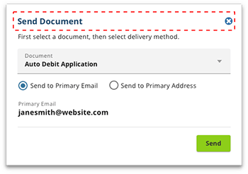
- Contains the title and a close button
- Title give context to the user
- 'Close' link should contain the 'X' icon, with alt text that says, "close"
Body
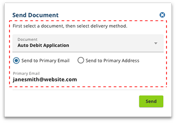
- Body may contain extra details
- Links can be used in a dialog, but its purpose should be used to navigate the user away from their current flow
Footer
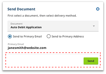
- Contain a primary call to action button, typically aligned to the right.
- Button labels should have actionable, understandable names
Small Screen
- Dialog content for small screens should be limited to a simple ask of the user, and should not contain complex forms.
Drawers
Usage
Drawers provide hidden navigation or supplemental content that can be accessed by the user as they need it. They are anchored to the screen edge, allowing the user to primarily focus on the main screen content.
- Consider how the drawer will behave in all view-port sizes. For example, navigation may utilize a drawer on smaller screens, but always be displayed on larger screens.
- Consider the number of navigational items, or the amount of supplemental content you have. Then determine if a drawer is the best way to display them.
Interaction Behaviors
- Drawer presence should be apparent with the use of a easily identifiable icon such as a hamburger. If using only an icon, appropriate alt text should be used.
- Closed by default, the drawer opens temporarily above all other content until a section is selected, or the drawer is closed.
Unifi Design System: How to implement drawers with Unifi Angular.
Examples and Variations
Navigation
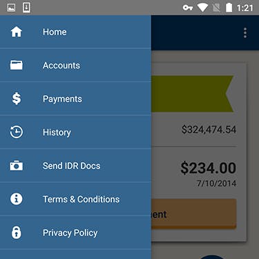
Navigational drawers can be closed by clicking/tapping outside of the drawer or pressing the Esc key.
Supplemental
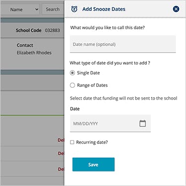
Supplemental drawers can be closed by clicking/tapping a close button or pressing the Esc key.
Sticky Content
Usage
Allows for select content to remain on screen as the user scrolls.
By default, all content should scroll as the user scrolls. However, there may be situations where select content should remain on screen at all times. This decision is very dependent on the use case, so you should weigh the value of the content as it pertains to the user scenario.
Scroll all content with the rest of the screen (default)
- When there is not useful navigation/information/actions that the user needs to access at any given moment.
- When screen real estate is at a premium.
Make some content sticky
- When there is useful navigation/information/actions that the user needs to access at any given moment.
- When sticky content can help give the user context, such as a shopping cart.
- You may consider other design solutions when sticky content isn't quite the right experience.
Strongly consider whether or not sticky content is necessary for small screens. Screen real estate is at a premium, however sticky navigation is a common practice for small screens.
Let's Chat!
Together, we can understand and assist with the challenge or opportunity on your mind.
Connect