
Visual Experience Guidelines
Visual elements such as typography and iconography help shape the overall look of a website or app. These components are often considered as part of the overall theme/style, but also consider these guidelines as you put them into use.
- Quick Links
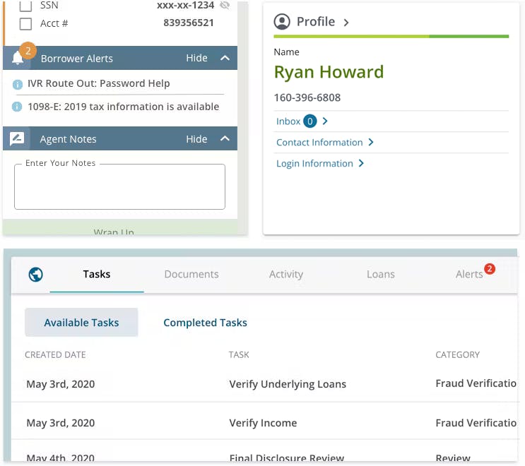
Badges
Usage
Badges are used to draw the user's attention to a specific area. They are contextually placed adjacent to the parent label, tab, or link.
- Alert a user of an issue within a specific area.
- Typically indicates the number of new or unaddressed items within a specific area. (i.e. 'X' unread messages or 'X' number of tasks to do)
- Generally, persists until the user views or addresses the content.
- Should be in the users control to remove or reduce the badge number or presence.
- Consider consistent location/placement throughout your product or product suite.
Dot badge usage
- Should rely on the presence (or absence) to indicate something, not the use of color.
- Consider utilizing tooltip to provide additional user understanding.
Unifi Design System: How to implement badges with Unifi Angular.
Examples and Variations
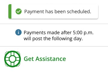
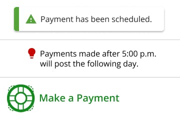
Color
Usage
Use color to support branding as well as visually organizing the information.
- Use color to highlight important information or call-to-actions.
- Consider color application to add meaning and enhance the overall aesthetics
- Consistent use of color throughout the app is critical
- By using tints/shades of color, we can assign varying levels of importance to elements.
- Color can provide information about the state of an app, its components, and elements. For example, the color use in different notification messages (blue, green, orange, red) can help communicate the situation.
- Use red with precaution. It is typically reserved for errors.
Accessibility Note
Careful consideration must be given to foreground/background color contrast to ensure the design meets Section 508 compliance. When using themes, be conscious of automatically generated tints/shades, and ensure that they pass compliance. Use the WebAIM Contrast Checker to check your color combinations. Do not rely color alone to highlight a particular area.
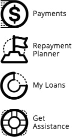
Iconography
Usage
Consistent visual graphics used to indicate meaning, and help users navigate. Icons should be simple and immediately understood.
System Icons
- Convey simple actions and functions.
- Symbolize common actions, files, devices, and directories.
- Display essential characteristics that can communicate metaphors at a glance.
- Universally recognized to display a specific function.
Wayfinding Icons
- Allow a user to orient themselves.
- Create an identity for an idea or area.
- Landmarks to provide orientation cues.
- Create regions of differing visual character.
Accessiblity Note
- Describe the meaning of an icon with alt text. For example, implement an alt attribute or title element for screen reader purposes.
- An icon must meet 3:1 color contrast requirements if there is accompanying text that goes with the icon, and the icon is simply the supportive element.
Use
- To help users understand, navigate or take action.
- To bring attention/visual interest to important page content.
- Consistently throughout the app.
- Commonly accepted icon meanings (e.g. i = more information, ? = help). An icon's meaning should generally be the same regardless of where or how it's used.
Do Not Use
- A commonly accepted icon for a totally different purpose.
- Without accompanying text or alt text.
- As ambiguous decoration that doesn't convey meaning.
- Many similar icons that could be confused with one another.
- Red icons for anything other than errors or warnings.
Examples and Variations
System
Wayfinding
Typography
Usage
Optimized typographic scales present the design and content clearly and efficiently.
Presentation
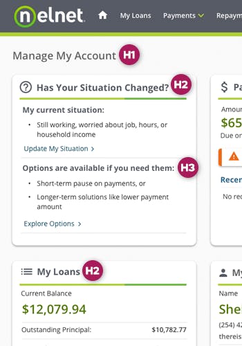
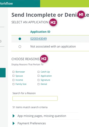
- The heading (H1) is the most important thing, and should introduce your page. There should only be one H1 per page.
- Line length can affect the ease and speed of your reading. Consider your audience, screen sizes and your application when writing content.
- Line height and letter spacing should be carefully considered for readability.
Alignment
- Left align paragraphs and larger sets of content for readability. Long-length center- and right-aligned content is difficult to read.
- Center alignment could be considered for shorter-lines, such as headlines, subheads, quotes, etc.
Accessiblity Note
Careful consideration must be given to font size, thickness and foreground/background color contrast to ensure the design meets Section 508 compliance. Use the WebAIM Contrast Checker to check your color combinations.
Use
- Limit your design to one or two font families to help ensure continuity.
- Rely on your theme and use proper typographic-scale semantics (H1, H2, H3, etc.).
- When emphasizing use bold face instead of italic, but don't abuse this.
Do Not Use
- Italicized styles sparingly and avoid them in headings.
- All UPPERCASE in sentences as it makes words difficult to read.
- Underline content unless it is a link.
- Font faces that are too thin. See accessibility note.
- Fonts smaller than 9 pt (12px). See accessibility note.
- Animated text.
Examples and Variations
Nelnet.com
IDR Workflow
Let's Chat!
Together, we can understand and assist with the challenge or opportunity on your mind.
Connect