
Navigation Guidelines
There are a number of ways to navigate throughout a website or application. However, different scenarios require different navigational components. These guidelines will help direct you to the best solution for your scenario.
- Quick Links
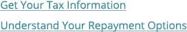
Links
Usage
Used for navigation, such as moving to another screen within the application.
- Links to pages and to external websites should open in the same (current) browser window, unless opening a link in the same window would result in the user being logged out of something they're logged into.
- Links to content objects (documents, PDFs, presentations, spreadsheets) should open in a new window.
- Linked text should be understandable on its own, outside the context of the surrounding text.
Unifi Design System: How to implement links with Unifi Angular.
Buttons vs. Links
- Buttons are for actions, such as submitting a form.
- Links are for navigation, such as moving to another screen within the application.
- Do not style a button as a link, nor a link as a button.
Use
Label links using explicit labels that explain what they do
Do Not Use

Avoid using vague labels that could be confusing
Examples and Variations
States
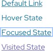
Default State should always include an underline when within paragraph text.
Ensure that the link style includes a hover state, keyboard focus state, and visited state defined. These styles improve the usability of your links, before, during and after clicking.
Use more than just color to distinguish hover/focus. In the example above, the removal of the underline indicates hover state, and a border round the link indicates focus.
Labeling

Provide enough information along with the link to users know what to expect when they click on it.
Providing understandable text (as mentioned above) but also indicating if the link will be opening a file other than a website, such as a PDF, presentation, spreadsheet, etc. This may include providing an informative icon next to the text link.
Accessibility Note
Consider visited state link colors (on all potential backgrounds) ratio and how it relates to non-visited links. The ideal state for contrast between link states (active vs visited, etc) is 4.5. (WCAG 2.0 and Link Colors).
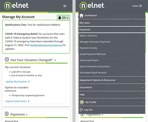
Menus
Usage
Menus are lists of content categories or features, typically presented as a set of links or icons grouped together with visual styling distinct from the rest of the design.
- A parent menu label should encompass/describe all menu items within it. In some cases, a properly coded icon may suffice.
- Ideal number of menu items should be between two and seven.
- In most cases menu should overlay content, vs push content aside.
- Ensure the menu content will remain accessible/usable regardless of screen size.
- Avoid fly-out/hover interaction. See Accessibility Note.
- Avoid going too many levels deep. Reconsider the information architecture if needed.
Navigational Menus
Navigational menus allow users to browse grouped lists of content and directly access content or features.
- Use a research-based information architecture to drive menu groupings.
- Leverage expected locations for navigation menus, such as anchored to the top.
- Always plan for the responsive experience with navigational menus.
- Indicate the current screen within the navigation menu.
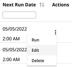
Task Menus
Task menus allow users to access additional functionality directly related to their task.
- Use to access actions directly related to the task the user is performing, such as Clone, Edit, or Delete.
- Use if the actions can't be placed directly on the page due to space or experience.
Accessibility Note
People with reduced dexterity, such as tremors, often have trouble operating fly-out/hover menus. For some, it might be impossible. Make sure to require a click or tab to open a menu, or provide other ways to the submenu items. (https://www.w3.org/WAI/tutorials/menus/flyout/)
Examples and Variations
Navigational Menu
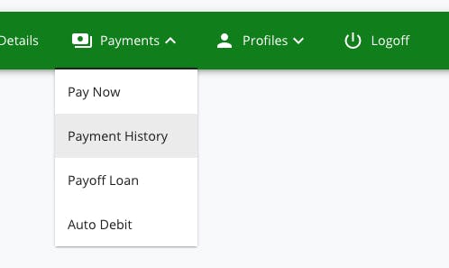
Task Menu
Responsive Navigational Menu
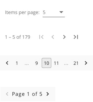
Pagination
Usage
Use pagination to divide large data sets into more manageable sections.
Consider how the user will be interacting with the content when determining if pagination is the right solution. Breaking up large datasets with pagination can help eliminate mental and technical overload. However, pagination can also add more complexity to the interface, which may be unnecessary for smaller datasets.
- Provide consistent controls that allow the user to; navigate forward and backward, navigate to the first or last screen, navigate to a specific page.
- Clearly indicate the active screen.
- Consistently place pagination components at the bottom of all screens.
- Ensure the controls include clear text, or alt text if using symbols.
- If you have a particular large data set with several pages, limit number of page links by providing an ellipses (...)
Unifi Design System: How to implement pagination with Unifi Angular.
Infinite Scrolling & Load More
Infinite scrolling is an alternate technique that loads content continuously as the user scrolls, eliminating the need for pagination. This technique works well for social media and news feeds, but not necessarily ideal for data-heavy content. It does not allow for a sense of being "done" viewing the list. If infinite scrolling is used, a robust filtering function should also be implemented. Work with your users to determine if infinite scrolling is a viable option.
Load More is yet another alternate technique that allows a user to load more records once they reach the bottom of the list. A load more action gives the user a sense of control, whereas infinite scrolling is controlled by the interface. This may be appropriate for customer-facing content, such as payment history. Similar to infinite scrolling, this option does not let the user know how many "pages" or results they have yet to browse.
Examples and Variations
Let's Chat!
Together, we can understand and assist with the challenge or opportunity on your mind.
Connect