
Accessibility
Accessibility is critical to the integrity of our experiences. Color contrast and font-size legibility are some of the many styling attributes we consider when ensuring 508 compliance.
- Related Capabilities
We design with the user in mind. And not all users are the same. This is why we practice inclusive design and ensure that the experiences and interactions we design are accessible to all users, regardless of ability.
Some of the basic accessibility principles that we keep in mind include:
- Means other than just color are used to indicate an action, prompt a response, or distinguish a visual element.
- An appropriate contrast ratio is used for text and iconography.
- Components that have the same functionality within a set of web pages are identified consistently.
- Content does not cause seizures and physical reactions.
- Users can easily navigate, find content, and determine where they are.
- All text is readable and understandable.
- Content appears and operates in predictable ways.
- Users are helped to avoid and correct mistakes.
Examples
Importance of Consistency
We recognize that providing consistency in interactions and design elements across an experience will help those with cognitive or attention deficit disorders identify landmarks, thus easing anxiety during task-based flows. Identifying common components and interactions to use throughout our designs allows us to maintain this consistency.
Color Use
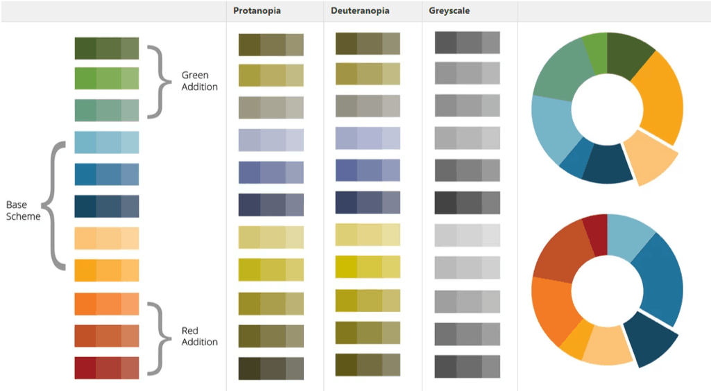
When visualizing data via graphs and complex graphics, we ask ourselves, how might that information translate for someone who is color blind or has other issues distinguishing between colors?
Pattern Use
Another strategy to achieve adequate contrast is to use a pattern in combination with color so that the differentiation of elements does not rely on color alone (e.g., in a line graph, different lines may be in different colors and also of different styles, such as solid, dashed, and dotted).

Additional Means of Differentiation
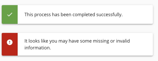
The most common type of color blindness makes it difficult to tell the difference between red and green, so simply designing messages that rely on color alone won't help all users determine if they've succeeded or failed at a glance.
This message design uses color to grab the user's attention but does not rely upon the color alone. It also includes iconography (with programmatic alternative text) and content to relay the message. When incorporated into a website the notification component will utilize accessible code and aria tags to focus screenreaders to the message when triggered.
Let's Chat!
Together, we can understand and assist with the challenge or opportunity on your mind.
Connect