
Data Visualization
Data visualization is the graphic representation of data, often used to make complex datasets or information much easier to understand.
- Related Capabilities
Data can be visualized in an infinite number of ways. Spreadsheets are great for organizing and comparing data sets, but they don't provide hierarchy. The viewer needs to flex their cognitive muscles in order to read a spreadsheet and understand the story. By turning complex data sets into a visual we can turn the numbers into something simple and memorable.
Examples
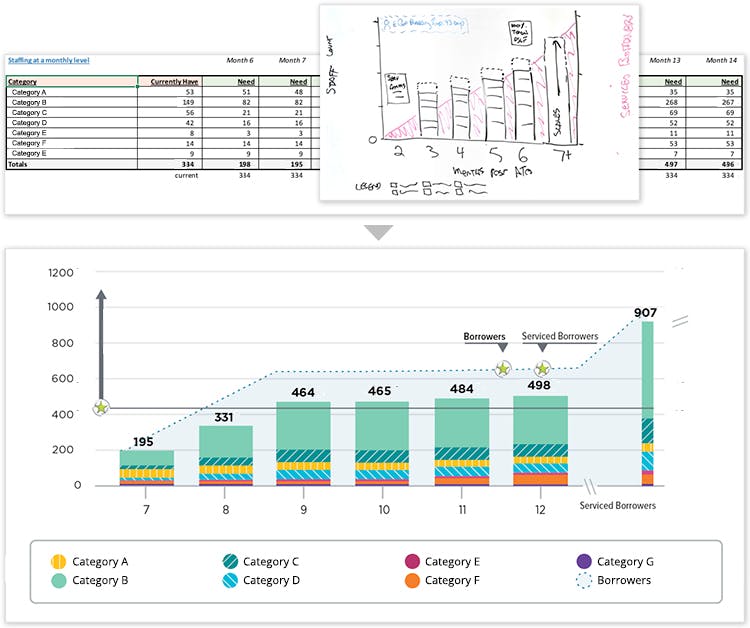
Staffing Ramp
As serviced borrowers migrated, we needed to demonstrate how associate count would also increase to match the demand. Using a bar chart to depict a roadmap, a viewer can see how the associate count would increase over time to match the portfolio volume over time.
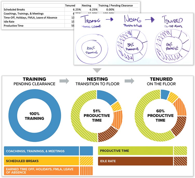
Time Utilization
We were tasked with visualizing how a call-center employee spends their time throughout their onboarding journey. Working from a spreadsheet, we were able to map the given numbers onto visuals. In the visualized format, the viewer can easily see how the employees time is spent as they gain experience on the job.
Let's Chat!
Together, we can understand and assist with the challenge or opportunity on your mind.
Connect